6 Screening Metrics Worth Tracking (And 4 That Waste Time)
 Regine CyrilleTechnology10 Sept 2026
Most recruiting dashboards report the same handful of numbers, and most of them were chosen because the applicant tracking system produced them by default rather than because anyone decided they were useful.
The test of a metric is not whether it is accurate. It is whether a change in the number tells you what to do differently on Monday. By that standard, a surprising amount of what gets reported to leadership every month is decoration: technically correct, entirely inert.
A recruiting metric that cannot change a decision is not a measurement. It is a report on the weather.
Why do recruiting dashboards keep improving while hiring does not?
Volume numbers have moved dramatically, but the outcomes have not followed. Greenhouse found applications per job posting up 111% between 2022 and 2025, while time-to-fill over the same period rose 37%. More input, slower output.
Meanwhile the metric everyone actually cares about remains largely unmeasured. LinkedIn's Future of Recruiting research, surveying 1,271 recruiting professionals, found that 89% agree measuring quality of hire is becoming more important while only 25% report high confidence in their ability to measure it.
That gap explains the dashboards. When the outcome is hard to measure, teams report the process instead, and process metrics reward motion.
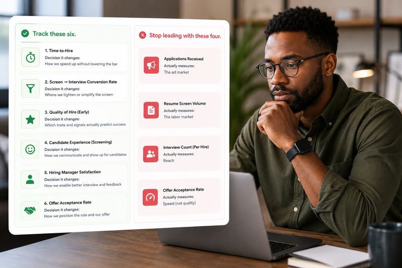
The six below are all things a screening process can actually change. The four after them are not.
1. Completion rate by stage
The share of candidates who start a stage and finish it. This is the cheapest signal you have about whether your process is doing damage before anyone has evaluated anybody.
Friction is measurable and it is larger than most teams assume. Appcast's benchmark study of 281 million clicks found a median apply rate of 6.13% on standard application forms against 19.37% for one-click applications, a threefold difference driven purely by form design.
Track it per stage rather than end-to-end. An overall completion rate tells you that you are losing people. A per-stage rate tells you where, which is the only version you can fix. Pay particular attention to any stage a candidate completes alone with software, since that is where drop-off currently concentrates.
Takeaway: the stage with your worst completion rate is your highest-return fix this quarter, regardless of what else is on the roadmap.
2. Pass-through rate by stage
What proportion of candidates advance from each stage to the next. Read as a series, it shows you where your process is actually deciding anything.
Ashby's analysis of 54 million applications gives usable reference points: recruiter screens pass roughly 35% of candidates, onsites around 24%, and post-onsite and offer stages run at 95% and 81%. The shape matters more than the exact figures. Late stages that pass almost everybody are confirmation, not evaluation.
A stage passing 95% of the people who reach it is either redundant or is being used to justify a decision made earlier. Both are worth knowing.
Takeaway: find your highest pass-through stage and ask what it would cost to remove it. If the answer is nothing, that is your answer.
3. Reviewer agreement
Take a sample of candidates, have two reviewers score them independently against the same criteria, and measure how often they land in the same place.
This is the metric that determines whether every other number means anything. A pass-through rate is only interpretable if the people producing it are applying the same standard. Structured formats exist precisely because unstructured ones do not: the 2023 re-analysis of selection validity by Sackett and colleagues puts structured interviews at .42 for predicting job performance and unstructured interviews at .19.
Ten double-scored candidates a month is enough. The point is not a precise coefficient, it is noticing when two competent reviewers reach different conclusions from identical evidence. On a high-volume role this is cheap to build into the day itself, the way a five-stage screening workflow does with a calibration check before the shortlist closes.
Takeaway: measure agreement before you invest in anything else on this list. Without it, every downstream number is noise you are reporting with confidence.
4. Cutoff stability
Where your pass or fail line actually sat, month over month, and whether it moved.
Most teams have a nominal bar and a real one, and the real one drifts with requisition pressure. When the pipeline is thin the bar quietly drops. When volume spikes it quietly rises. Nobody decides this and nobody records it, which means a candidate's outcome partly depends on what week they applied.
Tracking it is simple. Record the score or rating of your lowest-passing candidate each month and plot it. A stable line means your standard is a standard. A sawtooth means it is a function of your pipeline.
Takeaway: plot the lowest-passing score by month. If it moves more than a point either way, your bar is responding to volume rather than to the role.
5. Source-to-shortlist
Not applications by source. Shortlisted candidates by source. The denominator change is the whole point.
Sourcing is usually optimized on volume because volume is what job boards sell and what dashboards display. But a channel producing 400 applications and two shortlists is worse than one producing 40 and six, and volume reporting shows the opposite.
This is the metric that survives contact with the current application environment, where the raw count has stopped being informative. Gartner expects that by 2028, one in four candidate profiles worldwide will be fake. That is a forecast rather than a measurement, but it points the same direction. Counting applications will keep getting less useful.
Takeaway: rebuild your source report with shortlists as the numerator. Some of your best-performing channels by volume will move to the bottom.
6. Ninety-day performance correlation
For hires made six months to a year ago, the relationship between their screening score and their actual early performance rating.
This is the only metric on the list that tells you whether your screening works at all. Everything else measures whether the process runs smoothly. This measures whether the process is right.
It is also the one most teams never build, because it requires talking to whoever owns performance data and agreeing on a shared identifier. That conversation is a quarter of work once and then it runs forever. It is the difference between a recruiting function with an opinion and one with evidence.
Takeaway: you need thirty hires and one join between two systems. Start with a single job family rather than trying to build it for everything at once.
The four to stop reporting
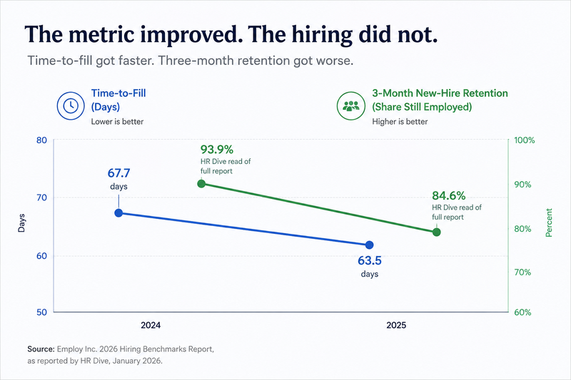
Time-to-hire as a headline number. It is the metric most likely to improve while hiring gets worse. Employ's 2026 benchmark data shows time-to-fill falling from 67.7 days to 63.5 while, as reported by HR Dive, the share of new hires still employed after three months fell from 93.9% to 84.6%. Speed is a constraint worth managing and a terrible thing to optimize. Track it as a diagnostic, never as a goal.
Cost-per-hire. It largely reports the advertising market. Appcast's most recent benchmark found cost-per-application and cost-per-hire rising sharply in 2025 despite a softer labor market, attributed to job board pricing and programmatic media models rather than anything about how anyone hires.
Offer acceptance rate in isolation. It tracks the labor market more than your process. Gartner found 48% of candidates accepted their most recent offer, down from 54% a year earlier and 85% two years before. A 37-point swing in two years is not a change in anyone's closing technique.
Total applications. It measures reach and is routinely presented as performance. Worse, it rewards exactly the behavior that creates the screening problem in the first place.
Takeaway: move all four to an appendix. They are worth having and they are not worth leading with.
Where to Start
Take your current recruiting dashboard and, next to each metric, write the specific decision that would change if the number moved by a fifth in either direction. Not "we would investigate", but the actual action.
Most dashboards lose half their contents to that exercise, and the half that survives is usually the half nobody reports upward. That is the report worth building.
Then add reviewer agreement, because it is the cheapest to start and it tells you whether the rest of your numbers are describing anything real. Ten double-scored candidates and a note of how often two people agreed. If the answer is uncomfortable, you have learned more from an hour of work than the dashboard told you all year.
FAQs
- Is time-to-hire really not worth tracking? It is worth tracking and not worth targeting. As a diagnostic it tells you where a process is stalling. As a goal it creates pressure to skip the steps that produce signal, and the cost shows up in early attrition, which no recruiting dashboard reports.
- How do we measure reviewer agreement without a data team? A spreadsheet. Two reviewers, ten candidates, independent scores, count the matches. The value is in the disagreements you then talk through, not in the statistic. Any team that has ever run a calibration session has already done the hard part.
- What if we cannot get performance data for the 90-day correlation? Use retention at 90 days as a proxy and be honest that it is a floor, not a ceiling. It is available in every HRIS, it requires no cooperation from anyone, and it will still catch a screening process that is systematically selecting the wrong people.
- How many metrics should a recruiting team actually report? Four or five, and the same ones every month. Rotating metrics is usually a sign that the team is looking for a number that flatters the current situation, and stakeholders notice faster than anyone expects.
Related Articles
- How to Screen 100 Applicants in a Day: A 5-Stage Workflow
- Do Candidates Trust AI Interviews? 6 Findings From 2026 Data
- How On-Demand Interviews Cut Time-to-Hire Without Sacrificing Quality
- AI Screening Software for Recruiters: A 12-Point Buyer's Checklist
Latest From Our Blog
Discover fresh insights, trends, and tips on tech talent and offshore development. Stay informed with our latest updates